I wrote Old Tom and the Old Tome in Scrivener. I converted it to an EPUB with Sigil. I tested it using Calibre, FBReader, Nook, Kobo, and Google Play Books. Then I published it on Smashwords and Kindle Direct.
Why a short story?
This one is probably obvious, but just in case it isn't: I started with a short story because when you want to learn a new skill, you want to start small. I didn't want to write something novel-length and then run into a bunch of problems.
A short story's the perfect length to start with. Old Tom and the Old Tome clocks in around 3,000 words, split up into 4 separate sections (cover, copyright, story, About the Author). It has a great structure for learning the ropes.
Of course, you don't have to go the fiction route. In fact, it occurs to me that this blog post would actually convert quite nicely into a short eBook. Hm, food for thought.
Scrivener
I checked out Scrivener because Charles Stross swears by it. It's basically an IDE for writing books; it's quite simply the most advanced and mature piece of software there is for the purpose.
There's a Linux version, but it's abandonware. For a GNU/Linux user such as myself, this is something of a double-edged sword: on the plus side, I get Scrivener for free, where Mac and Windows users have to pay $40 for it; on the minus side, if a system upgrade ever causes it to stop working, I'm SOL. If Scrivener stops working on my system, there's not going to be a fix, I'll be locked into a platform I can no longer use. I could try and see if the Windows version will run under WINE, but there's no guarantee of that.
The good news is that Scrivener saves its files in standard formats, so if it ever stops working I'll still be able to access my content in other programs. The bad news is that it saves its individual files with names like 3.rtf and 3_synopsis.txt.
So Scrivener's pretty great, and I'll probably stick with it for a little while even though there are no more updates on the horizon for my OS -- but there's a definite downside to using the Linux version. (And if they decided the Linux version wasn't going to bring in enough profit to justify maintaining it, what happens if they decide the same thing for the Windows version someday, maybe leave it as a Mac-only product?)
Getting Started
Scrivener's got a great tutorial to run through its functionality; start there.
When you're done with the tutorial and ready to get to work on your book, I recommend using the Novel template, even if you're not writing a novel, because it automatically includes Front Matter and Back Matter sections; the Short Story template does not.
Scrivener's got your standard MS-word-style tools for formatting your work. I didn't use them. Since I was targeting a digital-only release and no print version, I wrote my story in Markdown, which converts trivially to HTML but isn't as verbose as HTML.
Output Formats
Since I went the Markdown route, I found that the best option for output at compile time was Plain Text (.txt). The most vexing thing I found about the output was the limited options under the "Text Separator" option -- the thing that goes between different sections. What I wanted was a linebreak, followed by ***, followed by another linebreak. Scrivener doesn't have any option for that -- your options are Single Return, Empty Line, Page Break, and Custom. Under Custom you can put ***, but there doesn't seem to be any way to put a linebreak on either side of it. So I found the best option was to just do that, and then manually edit the text file it put out and add a linebreak on either side of each one.
If you plan on making an EPUB file, you'll probably want to keep all the "smart quotes" and other symbols that Scrivener adds to your text file. However, if you want to distribute the Markdown file in plain text and want it to be readable in Chrome, you'll need to remove all the pretty-print characters, because Chrome won't render them correctly in a plain-text file (though it'll do it just fine in a properly-formatted HTML file). You'll also want to use the .txt extension rather than .md or .markdown if you want the file to display in Firefox (instead of prompting a download).
You've got different options for converting from Markdown to HTML. Pandoc is a versatile command-line tool for converting between all sorts of different formats, but I don't like the way it converts from Markdown to HTML; not enough linebreaks or tabs for my tastes. There are probably command-line flags to customize those output settings, but I didn't find them when I glanced through the man page.
I thought Scrivener's Multimarkdown to Web Page (.html) compile option worked pretty well, although the version I used (1.9 for Linux) has a bug that none of the checkboxes to remove fancy characters work correctly: you're getting smartquotes whether you want them or not. You also don't want to use *** as your section separator, because Scrivener reads it as an italicized asterisk (an asterisk in-between two other asterisks, get it?) instead of an HR. Similarly, it reads --- as an indicator that the previous line of text is an h2.
So your best bet for a section break is something like
</p><hr/><p>or
<div class="break">*</div>(Actually, you don't want to use HR's at all in an EPUB, for reasons I'll get to later, but if you want to distribute an HTML version of your book, it's fine to use them in that version.)
Sigil
Sigil is an excellent, very straightforward tool for editing the EPUB format. I recommend you grab the Sigil User Guide, go through the Tutorial section, and do what it tells you -- even the stuff that generates seemingly ugly code. For example, if you use Sigil's Add Cover tool, you wind up with code that looks like this:
<svg xmlns="http://www.w3.org/2000/svg" height="100%" preserveAspectRatio="xMidYMid meet" version="1.1" viewBox="0 0 900 1350" width="100%" xmlns:xlink="http://www.w3.org/1999/xlink">
  <image width="900" height="1350" xlink:href="../Images/cover.jpg"/>
</svg>
If you're like me, looking at that makes you wince. And your instinct will be to replace it with something simple, like this:
<img src="../Images/cover.jpg" alt="Cover" />But don't do that. Removing the <svg> tag, or even removing those ugly-ass inline styling attributes, will prevent the cover from displaying correctly as a thumbnail in readers.
(If there is a way to clean up that ugly <svg> tag and still have the thumbnail display correctly, please let me know; I'd love to hear it.)
Now, Sigil is for the EPUB2 format. It doesn't support any of the newfangled fancy features of EPUB3, and neither do most readers at this point. You're going to want to keep your styles simple. In fact, here's the entire CSS file from Old Tom and the Old Tome:
img {
  max-width: 100%;
}

h1 {
  text-align: left;
  text-indent: 0;
  font-size: 200%;
}

.noindent {
  text-indent: 0;
}

.break {
  margin: 1em 0;
  text-align: center;
}
Oh, and that last class, .break? That's there because some readers ignore <hr/> tags. FBReader on Android, for example, will not display an HR. No matter how I tried formatting it, it wouldn't render. Not as a thin line, not even as a margin. If you use an <hr/> tag in your EPUB file, FBReader will act as if it isn't there.
So I wound up cribbing a style I saw in Tor's EPUB version of The Bloodline Feud by Charles Stross:
<div class="break">*</div>where, as noted in the above CSS, the .break class centers the text and puts a 1em margin above and below it.
(Some readers won't respect even that sort of simple styling, either; Okular parses the margin above and below the * but ignores the text-align: center style. Keep this in mind when you're building an EPUB file: keep the styles simple, and remember that some readers will straight-up ignore them anyway.)
(Also: this should go without saying, but while it's okay to look through other eBooks for formatting suggestions and lifting a few lines' worth of obvious styling is no problem, you don't want to go and do anything foolish like grab an entire CSS file, unless it's from a source that explicitly allows it. Even then, it might not be a good idea; formatting that works in somebody else's book may not be a good idea in yours.)
Testing
Once my EPUB was done, I tested it in a number of different readers for a number of different platforms at a number of different resolutions. There are a lot of e-readers out there, and their standards compliance is inconsistent -- much moreso than the browser market, where there are essentially only three families of rendering engines.
If you're used to using an exhaustive, precise set of CSS resets for cross-browser consistency, you probably expect to use something similar for e-readers. Put that thought out of your head; you're not going to find them. The best you're going to get are a few loose guidelines.
Consistency across different e-readers just isn't attainable in the way that it is across different web browsers. Don't make that a goal, and don't expect it to happen. You're not looking for your eBook to display perfectly in every reader; you're just looking for it to be good enough in a few of the most-used readers.
For example, I found that the margins the Nook reader put around my story were fine on a tablet, but I thought they were too much on a phone. If I'd wanted, I could have futzed around with media queries and seen if that was possible to fix -- but I decided no, it was Good Enough; it wasn't worth the effort of trying to fix it just for that one use-case.
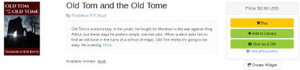
Smashwords
Smashwords has a useful FAQ on self-publishing, and also provides a free EPUB download called the Smashwords Style Guide.
If you already know HTML, here's what I can tell you about the Smashwords Style Guide: read the FAQ at the beginning, then skip to Step 21: Front Matter. Because it turns out that Steps 1-20 are about how to try and make Microsoft Word output clean HTML and CSS. If you already know how to write HTML and CSS yourself, there is of course absolutely no fucking reason why you would ever want to use Word to write your HTML and CSS for you.
It's probably a good idea to read the rest of the guide from Step 21 through the end, but most of it's pretty simple stuff. To tell the truth, there are exactly two modifications I made to the EPUB for the Smashwords edition: I added the phrase "Smashwords edition" to the copyright page, and I put ### at the end of the story (before the back matter). That's it.
For all the time the guide spends telling you how easy it is to fuck up and submit a file that will fail validation, I experienced none of that. My EPUB validated immediately, and it was approved for Smashwords Premium the next day (though Smashwords says it usually takes 1-2 weeks; the quick turnaround may have been a function of how short my short story is).
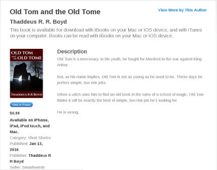
Description
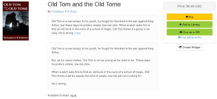
Most of the forms you fill out on the Smashwords Publish page are well-documented and/or self-explanatory. The Long Description and Short Description fields are exceptions; it's probably not entirely clear, at a glance, where your listing will show the short description and where it will show the short one. So here's how they work:
On Smashwords, your book's listing shows the short description, followed by a link that says "More". When you click "More", the long description appears underneath the short description.
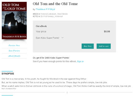
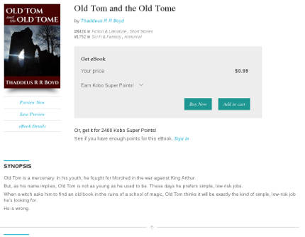
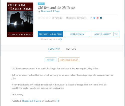
Kobo and iBooks don't appear to use the short description at all. Your book's listing will show the first few lines of your long description, followed by an arrow (on Kobo) or a "More..." link (on iBooks), which you can click to expand to show the entire description.

Aside: Why the fuck does it do this?
Look at all that whitespace. What's the point of hiding the text?
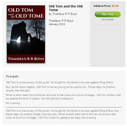
Inktera shows the long description, followed by an HR, followed by the short description.
And Scribd just shows the long description.
Lastly, Blio doesn't show either description of my book. Clearly this is a problem and I should probably talk to tech support about it.
As you might expect, the various different ways the different sites use the two descriptions create a bit of a conundrum: how can you write a short description that is the primary description on one site and a long description that is the primary description on four other sites, and write the two descriptions so that they don't look pointless and redundant when you put them side-by-side?
I haven't come up with a good solution for this in the case of Old Tom yet.
Amazon
It turns out the Amazon conversion is really easy. I just set up an account at kdp.amazon.com, filled out the forms, uploaded the cover and the EPUB file, and Amazon's automatic conversion software switched it over to Kindle format with no trouble at all. Amazon's even got a really nice online reader that lets you check how your file will look in the Kindle Reader on various devices (Kindle Fire HD, iPhone, iPad, Android phone, Android tablet, etc.).
I only hit one speed bump when I submitted to Amazon: after a few hours, I got an E-Mail back saying that the book was freely available online (because of course it is; I've posted it in multiple places, including this site). Amazon required me to go back through and reaffirm that I am the copyright holder of the book -- which meant just going through the exact same forms I'd already filled out and clicking the Submit button again. It was a little bit annoying, but not time-consuming and mostly painless, and the book appeared for download on Amazon shortly after.
And that's it.
The hardest part of self-publishing an eBook was finding the time, figuring out what resources to use, and learning the EPUB format. And now that I know what resources to use and understand the EPUB format, it doesn't take nearly as much time. For my next book, I'll be able to spend a lot more time writing and a lot less time formatting. Hopefully this blog post has helped you so that you can do the same.